22. Likelihood Ratio Processes#
In addition to what’s in Anaconda, this lecture will need the following libraries:
!pip install --upgrade quantecon
22.1. Overview#
This lecture describes likelihood ratio processes and some of their uses.
We’ll study the same setting that is also used in this lecture on exchangeability.
Among the things that we’ll learn are
How a likelihood ratio process is a key ingredient in frequentist hypothesis testing
How a receiver operator characteristic curve summarizes information about a false alarm probability and power in frequentist hypothesis testing
How a statistician can combine frequentist probabilities of type I and type II errors to form posterior probabilities of mistakes in a model selection or in an individual-classification problem
How to use a Kullback-Leibler divergence to quantify the difference between two probability distributions with the same support
How during World War II the United States Navy devised a decision rule for doing quality control on lots of ammunition, a topic that sets the stage for this lecture
A peculiar property of likelihood ratio processes
Let’s start by importing some Python tools.
import matplotlib.pyplot as plt
import numpy as np
from numba import vectorize, jit
from math import gamma
from scipy.integrate import quad
from scipy.optimize import brentq, minimize_scalar
from scipy.stats import beta as beta_dist
import pandas as pd
from IPython.display import display, Math
import quantecon as qe
22.2. Likelihood Ratio Process#
A nonnegative random variable \(W\) has one of two probability density functions, either \(f\) or \(g\).
Before the beginning of time, nature once and for all decides whether she will draw a sequence of IID draws from either \(f\) or \(g\).
We will sometimes let \(q\) be the density that nature chose once and for all, so that \(q\) is either \(f\) or \(g\), permanently.
Nature knows which density it permanently draws from, but we the observers do not.
We know both \(f\) and \(g\) but we don’t know which density nature chose.
But we want to know.
To do that, we use observations.
We observe a sequence \(\{w_t\}_{t=1}^T\) of \(T\) IID draws that we know came from either \(f\) or \(g\).
We want to use these observations to infer whether nature chose \(f\) or \(g\).
A likelihood ratio process is a useful tool for this task.
To begin, we define a key component of a likelihood ratio process, namely, the time \(t\) likelihood ratio as the random variable
We assume that \(f\) and \(g\) both put positive probabilities on the same intervals of possible realizations of the random variable \(W\).
That means that under the \(g\) density, \(\ell (w_t)= \frac{f\left(w_{t}\right)}{g\left(w_{t}\right)}\) is a nonnegative random variable with mean \(1\).
A likelihood ratio process for sequence \(\left\{ w_{t}\right\} _{t=1}^{\infty}\) is defined as
where \(w^t=\{ w_1,\dots,w_t\}\) is a history of observations up to and including time \(t\).
Sometimes for shorthand we’ll write \(L_t = L(w^t)\).
Notice that the likelihood process satisfies the recursion
The likelihood ratio and its logarithm are key tools for making inferences using a classic frequentist approach due to Neyman and Pearson [Neyman and Pearson, 1933].
To help us appreciate how things work, the following Python code evaluates \(f\) and \(g\) as two different Beta distributions, then computes and simulates an associated likelihood ratio process by generating a sequence \(w^t\) from one of the two probability distributions, for example, a sequence of IID draws from \(g\).
# Parameters for the two Beta distributions
F_a, F_b = 1, 1
G_a, G_b = 3, 1.2

@vectorize
def p(x, a, b):
    """Beta distribution density function."""
    r = gamma(a + b) / (gamma(a) * gamma(b))
    return r * x** (a-1) * (1 - x) ** (b-1)

f = jit(lambda x: p(x, F_a, F_b))
g = jit(lambda x: p(x, G_a, G_b))

def create_beta_density(a, b):
    """Create a beta density function with specified parameters."""
    return jit(lambda x: p(x, a, b))

def likelihood_ratio(w, f_func, g_func):
    """Compute likelihood ratio for observation(s) w."""
    return f_func(w) / g_func(w)

@jit
def simulate_likelihood_ratios(a, b, f_func, g_func, T=50, N=500):
    """
    Generate N sets of T observations of the likelihood ratio.
    """
    l_arr = np.empty((N, T))
    for i in range(N):
        for j in range(T):
            w = np.random.beta(a, b)
            l_arr[i, j] = f_func(w) / g_func(w)
    return l_arr

def simulate_sequences(distribution, f_func, g_func,
        F_params=(1, 1), G_params=(3, 1.2), T=50, N=500):
    """
    Generate N sequences of T observations from specified distribution.
    """
    if distribution == 'f':
        a, b = F_params
    elif distribution == 'g':
        a, b = G_params
    else:
        raise ValueError("distribution must be 'f' or 'g'")

    l_arr = simulate_likelihood_ratios(a, b, f_func, g_func, T, N)
    l_seq = np.cumprod(l_arr, axis=1)
    return l_arr, l_seq

def plot_likelihood_paths(l_seq, title="Likelihood ratio paths",
                        ylim=None, n_paths=None):
    """Plot likelihood ratio paths."""
    N, T = l_seq.shape
    n_show = n_paths or min(N, 100)

    plt.figure(figsize=(10, 6))
    for i in range(n_show):
        plt.plot(range(T), l_seq[i, :], color='b', lw=0.8, alpha=0.5)

    if ylim:
        plt.ylim(ylim)
    plt.title(title)
    plt.xlabel('t')
    plt.ylabel('$L(w^t)$')
    plt.show()
22.3. Nature permanently draws from density g#
We first simulate the likelihood ratio process when nature permanently draws from \(g\).
# Simulate when nature draws from g
l_arr_g, l_seq_g = simulate_sequences('g', f, g, (F_a, F_b), (G_a, G_b))
plot_likelihood_paths(l_seq_g,
                     title="$L(w^{t})$ paths when nature draws from g",
                     ylim=[0, 3])
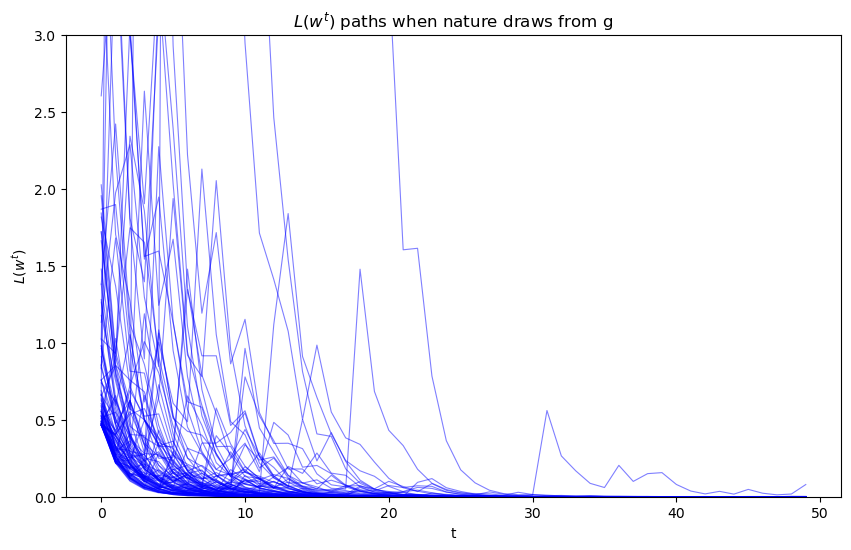
Evidently, as sample length \(T\) grows, most probability mass shifts toward zero
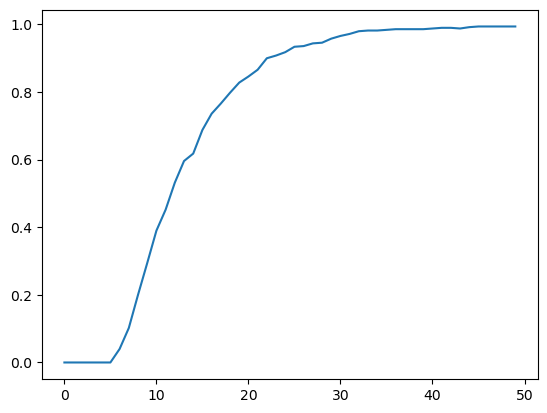
To see this more clearly, we plot over time the fraction of paths \(L\left(w^{t}\right)\) that fall in the interval \(\left[0, 0.01\right]\).
N, T = l_arr_g.shape
plt.plot(range(T), np.sum(l_seq_g <= 0.01, axis=0) / N)
plt.show()
Despite the evident convergence of most probability mass to a very small interval near \(0\), the unconditional mean of \(L\left(w^t\right)\) under probability density \(g\) is identically \(1\) for all \(t\).
To verify this assertion, first notice that as mentioned earlier the unconditional mean \(E\left[\ell \left(w_{t}\right)\bigm|q=g\right]\) is \(1\) for all \(t\):
which immediately implies
Because \(L(w^t) = \ell(w_t) L(w^{t-1})\) and \(\{w_t\}_{t=1}^t\) is an IID sequence, we have
for any \(t \geq 1\).
Mathematical induction implies \(E\left[L\left(w^{t}\right)\bigm|q=g\right]=1\) for all \(t \geq 1\).
22.4. Peculiar property#
How can \(E\left[L\left(w^{t}\right)\bigm|q=g\right]=1\) possibly be true when most probability mass of the likelihood ratio process is piling up near \(0\) as \(t \rightarrow + \infty\)?
The answer is that as \(t \rightarrow + \infty\), the distribution of \(L_t\) becomes more and more fat-tailed: enough mass shifts to larger and larger values of \(L_t\) to make the mean of \(L_t\) continue to be one despite most of the probability mass piling up near \(0\).
To illustrate this peculiar property, we simulate many paths and calculate the unconditional mean of \(L\left(w^t\right)\) by averaging across these many paths at each \(t\).
l_arr_g, l_seq_g = simulate_sequences('g',
                f, g, (F_a, F_b), (G_a, G_b), N=50000)
It would be useful to use simulations to verify that unconditional means \(E\left[L\left(w^{t}\right)\right]\) equal unity by averaging across sample paths.
But it would be too computer-time-consuming for us to do that here simply by applying a standard Monte Carlo simulation approach.
The reason is that the distribution of \(L\left(w^{t}\right)\) is extremely skewed for large values of \(t\).
Because the probability density in the right tail is close to \(0\), it just takes too much computer time to sample enough points from the right tail.
We explain the problem in more detail in this lecture.
There we describe an alternative way to compute the mean of a likelihood ratio by computing the mean of a different random variable by sampling from a different probability distribution.
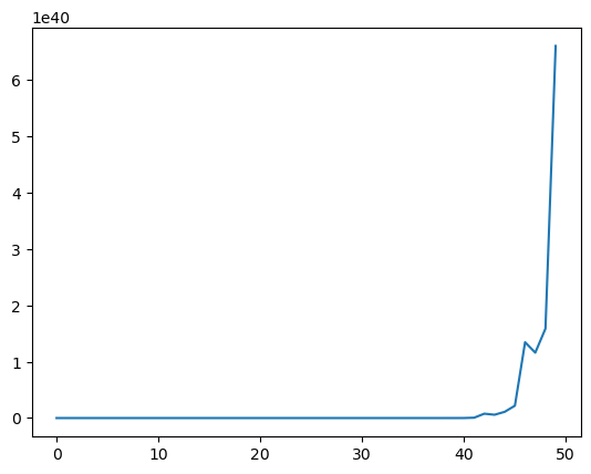
22.5. Nature permanently draws from density f#
Now suppose that before time \(0\) nature permanently decided to draw repeatedly from density \(f\).
While the mean of the likelihood ratio \(\ell \left(w_{t}\right)\) under density \(g\) is \(1\), its mean under the density \(f\) exceeds one.
To see this, we compute
This in turn implies that the unconditional mean of the likelihood ratio process \(L(w^t)\) diverges toward \(+ \infty\).
Simulations below confirm this conclusion.
Please note the scale of the \(y\) axis.
# Simulate when nature draws from f
l_arr_f, l_seq_f = simulate_sequences('f', f, g,
                        (F_a, F_b), (G_a, G_b), N=50000)
N, T = l_arr_f.shape
plt.plot(range(T), np.mean(l_seq_f, axis=0))
plt.show()
We also plot the probability that \(L\left(w^t\right)\) falls into the interval \([10000, \infty)\) as a function of time and watch how fast probability mass diverges to \(+\infty\).
plt.plot(range(T), np.sum(l_seq_f > 10000, axis=0) / N)
plt.show()
22.6. Likelihood ratio test#
We now describe how to employ the machinery of Neyman and Pearson [Neyman and Pearson, 1933] to test the hypothesis that history \(w^t\) is generated by repeated IID draws from density \(f\).
Denote \(q\) as the data generating process, so that \(q=f \text{ or } g\).
Upon observing a sample \(\{W_i\}_{i=1}^t\), we want to decide whether nature is drawing from \(g\) or from \(f\) by performing a (frequentist) hypothesis test.
We specify
Null hypothesis \(H_0\): \(q=f\),
Alternative hypothesis \(H_1\): \(q=g\).
Neyman and Pearson proved that the best way to test this hypothesis is to use a likelihood ratio test that takes the form:
accept \(H_0\) if \(L(W^t) > c\),
reject \(H_0\) if \(L(W^t) < c\),
where \(c\) is a given discrimination threshold.
Setting \(c =1\) is a common choice.
We’ll discuss consequences of other choices of \(c\) below.
This test is best in the sense that it is uniformly most powerful.
To understand what this means, we have to define probabilities of two important events that allow us to characterize a test associated with a given threshold \(c\).
The two probabilities are:
Probability of a Type I error in which we reject \(H_0\) when it is true:
\[ \alpha \equiv \Pr\left\{ L\left(w^{t}\right)<c\mid q=f\right\} \]Probability of a Type II error in which we accept \(H_0\) when it is false:
\[ \beta \equiv \Pr\left\{ L\left(w^{t}\right)>c\mid q=g\right\} \]
These two probabilities underlie the following two concepts:
Probability of false alarm (= significance level = probability of Type I error):
\[ \alpha \equiv \Pr\left\{ L\left(w^{t}\right)<c\mid q=f\right\} \]Probability of detection (= power = 1 minus probability of Type II error):
\[ 1-\beta \equiv \Pr\left\{ L\left(w^{t}\right)<c\mid q=g\right\} \]
The Neyman-Pearson Lemma states that among all possible tests, a likelihood ratio test maximizes the probability of detection for a given probability of false alarm.
Another way to say the same thing is that among all possible tests, a likelihood ratio test maximizes power for a given significance level.
We want a small probability of false alarm and a large probability of detection.
With sample size \(t\) fixed, we can change our two probabilities by adjusting \(c\).
A troublesome “that’s life” fact is that these two probabilities move in the same direction as we vary the critical value \(c\).
Without specifying quantitative losses from making Type I and Type II errors, there is little that we can say about how we should trade off probabilities of the two types of mistakes.
We do know that increasing sample size \(t\) improves statistical inference.
Below we plot some informative figures that illustrate this.
We also present a classical frequentist method for choosing a sample size \(t\).
Let’s start with a case in which we fix the threshold \(c\) at \(1\).
c = 1
Below we plot empirical distributions of logarithms of the cumulative likelihood ratios simulated above, which are generated by either \(f\) or \(g\).
Taking logarithms has no effect on calculating the probabilities because the log is a monotonic transformation.
As \(t\) increases, the probabilities of making Type I and Type II errors both decrease, which is good.
This is because most of the probability mass of log\((L(w^t))\) moves toward \(-\infty\) when \(g\) is the data generating process, while log\((L(w^t))\) goes to \(\infty\) when data are generated by \(f\).
That disparate behavior of log\((L(w^t))\) under \(f\) and \(g\) is what makes it possible eventually to distinguish \(q=f\) from \(q=g\).
def plot_log_histograms(l_seq_f, l_seq_g, c=1, time_points=[1, 7, 14, 21]):
    """Plot log likelihood ratio histograms."""
    fig, axs = plt.subplots(2, 2, figsize=(12, 8))

    for i, t in enumerate(time_points):
        nr, nc = i // 2, i % 2

        axs[nr, nc].axvline(np.log(c), color="k", ls="--")

        hist_f, x_f = np.histogram(np.log(l_seq_f[:, t]), 200, density=True)
        hist_g, x_g = np.histogram(np.log(l_seq_g[:, t]), 200, density=True)

        axs[nr, nc].plot(x_f[1:], hist_f, label="dist under f")
        axs[nr, nc].plot(x_g[1:], hist_g, label="dist under g")

        # Fill error regions
        for j, (x, hist, label) in enumerate(
            zip([x_f, x_g], [hist_f, hist_g],
            ["Type I error", "Type II error"])):
            ind = x[1:] <= np.log(c) if j == 0 else x[1:] > np.log(c)
            axs[nr, nc].fill_between(x[1:][ind], hist[ind],
                                    alpha=0.5, label=label)

        axs[nr, nc].legend()
        axs[nr, nc].set_title(f"t={t}")

    plt.show()

plot_log_histograms(l_seq_f, l_seq_g, c=c)
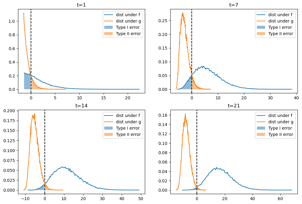
In the above graphs,
the blue areas are related to but not equal to probabilities \(\alpha \) of a type I error because they are integrals of \(\log L_t\), not integrals of \(L_t\), over rejection region \(L_t < 1\)
the orange areas are related to but not equal to probabilities \(\beta \) of a type II error because they are integrals of \(\log L_t\), not integrals of \(L_t\), over acceptance region \(L_t > 1\)
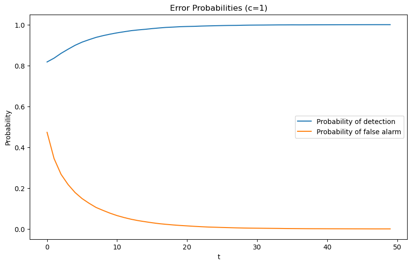
When we hold \(c\) fixed at \(c=1\), the following graph shows that
the probability of detection monotonically increases with increases in \(t\)
the probability of a false alarm monotonically decreases with increases in \(t\).
def compute_error_probabilities(l_seq_f, l_seq_g, c=1):
    """
    Compute Type I and Type II error probabilities.
    """
    N, T = l_seq_f.shape

    # Type I error (false alarm) - reject H0 when true
    PFA = np.array([np.sum(l_seq_f[:, t] < c) / N for t in range(T)])

    # Type II error - accept H0 when false
    beta = np.array([np.sum(l_seq_g[:, t] >= c) / N for t in range(T)])

    # Probability of detection (power)
    PD = np.array([np.sum(l_seq_g[:, t] < c) / N for t in range(T)])

    return {
        'alpha': PFA,
        'beta': beta,
        'PD': PD,
        'PFA': PFA
    }

def plot_error_probabilities(error_dict, T, c=1, title_suffix=""):
    """Plot error probabilities over time."""
    plt.figure(figsize=(10, 6))
    plt.plot(range(T), error_dict['PD'], label="Probability of detection")
    plt.plot(range(T), error_dict['PFA'], label="Probability of false alarm")
    plt.xlabel("t")
    plt.ylabel("Probability")
    plt.title(f"Error Probabilities (c={c}){title_suffix}")
    plt.legend()
    plt.show()

error_probs = compute_error_probabilities(l_seq_f, l_seq_g, c=c)
N, T = l_seq_f.shape
plot_error_probabilities(error_probs, T, c)
For a given sample size \(t\), the threshold \(c\) uniquely pins down probabilities of both types of error.
If for a fixed \(t\) we now free up and move \(c\), we will sweep out the probability of detection as a function of the probability of false alarm.
This produces a receiver operating characteristic curve (ROC curve).
Below, we plot receiver operating characteristic curves for different sample sizes \(t\).
def plot_roc_curves(l_seq_f, l_seq_g, t_values=[1, 5, 9, 13], N=None):
    """Plot ROC curves for different sample sizes."""
    if N is None:
        N = l_seq_f.shape[0]

    PFA = np.arange(0, 100, 1)

    plt.figure(figsize=(10, 6))
    for t in t_values:
        percentile = np.percentile(l_seq_f[:, t], PFA)
        PD = [np.sum(l_seq_g[:, t] < p) / N for p in percentile]
        plt.plot(PFA / 100, PD, label=f"t={t}")

    plt.scatter(0, 1, label="perfect detection")
    plt.plot([0, 1], [0, 1], color='k', ls='--', label="random detection")

    plt.arrow(0.5, 0.5, -0.15, 0.15, head_width=0.03)
    plt.text(0.35, 0.7, "better")
    plt.xlabel("Probability of false alarm")
    plt.ylabel("Probability of detection")
    plt.legend()
    plt.title("ROC Curve")
    plt.show()


plot_roc_curves(l_seq_f, l_seq_g, t_values=range(1, 15, 4), N=N)
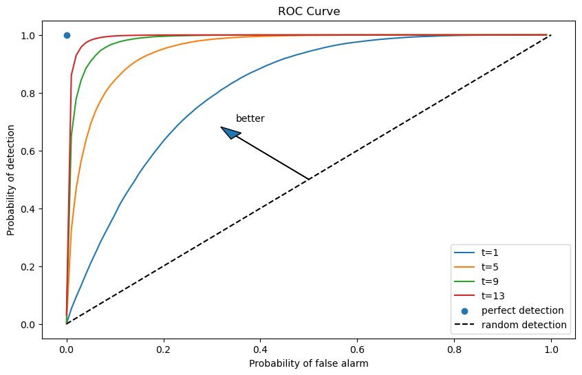
Notice that as \(t\) increases, we are assured a larger probability of detection and a smaller probability of false alarm associated with a given discrimination threshold \(c\).
For a given sample size \(t\), both \(\alpha\) and \(\beta\) change as we vary \(c\).
As we increase \(c\)
\(\alpha \equiv \Pr\left\{ L\left(w^{t}\right)<c\mid q=f\right\}\) increases
\(\beta \equiv \Pr\left\{ L\left(w^{t}\right)>c\mid q=g\right\}\) decreases
As \(t \rightarrow + \infty\), we approach the perfect detection curve that is indicated by a right angle hinging on the blue dot.
For a given sample size \(t\), the discrimination threshold \(c\) determines a point on the receiver operating characteristic curve.
It is up to the test designer to trade off probabilities of making the two types of errors.
But we know how to choose the smallest sample size to achieve given targets for the probabilities.
Typically, frequentists aim for a high probability of detection that respects an upper bound on the probability of false alarm.
Below we show an example in which we fix the probability of false alarm at \(0.05\).
The required sample size for making a decision is then determined by a target probability of detection, for example, \(0.9\), as depicted in the following graph.
PFA = 0.05
PD = np.empty(T)

for t in range(T):

    c = np.percentile(l_seq_f[:, t], PFA * 100)
    PD[t] = np.sum(l_seq_g[:, t] < c) / N

plt.plot(range(T), PD)
plt.axhline(0.9, color="k", ls="--")

plt.xlabel("t")
plt.ylabel("Probability of detection")
plt.title(f"Probability of false alarm={PFA}")
plt.show()
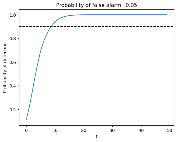
The United States Navy evidently used a procedure like this to select a sample size \(t\) for doing quality control tests during World War II.
A Navy Captain who had been ordered to perform tests of this kind had doubts about it that he presented to Milton Friedman, as we describe in this lecture.
22.6.1. A third distribution \(h\)#
Now let’s consider a case in which neither \(g\) nor \(f\) generates the data.
Instead, a third distribution \(h\) does.
Let’s study how accumulated likelihood ratios \(L\) behave when \(h\) governs the data.
A key tool here is called Kullback–Leibler divergence we studied in Statistical Divergence Measures.
In our application, we want to measure how much \(f\) or \(g\) diverges from \(h\)
Two Kullback–Leibler divergences pertinent for us are \(K_f\) and \(K_g\) defined as
Let’s compute the Kullback–Leibler discrepancies using the same code in Statistical Divergence Measures.
def compute_KL(f, g):
    """
    Compute KL divergence KL(f, g)
    """
    integrand = lambda w: f(w) * np.log(f(w) / g(w))
    val, _ = quad(integrand, 1e-5, 1-1e-5)
    return val

def compute_KL_h(h, f, g):
    """
    Compute KL divergences with respect to reference distribution h
    """
    Kf = compute_KL(h, f)
    Kg = compute_KL(h, g)
    return Kf, Kg
22.6.2. A helpful formula#
There is a mathematical relationship between likelihood ratios and KL divergence.
When data is generated by distribution \(h\), the expected log likelihood ratio is:
where \(L_t=\prod_{j=1}^{t}\frac{f(w_j)}{g(w_j)}\) is the likelihood ratio process.
Equation (22.1) tells us that:
When \(K_g < K_f\) (i.e., \(g\) is closer to \(h\) than \(f\) is), the expected log likelihood ratio is negative, so \(L\left(w^t\right) \rightarrow 0\).
When \(K_g > K_f\) (i.e., \(f\) is closer to \(h\) than \(g\) is), the expected log likelihood ratio is positive, so \(L\left(w^t\right) \rightarrow + \infty\).
Let’s verify this using simulation.
In the simulation, we generate multiple paths using Beta distributions \(f\), \(g\), and \(h\), and compute the paths of \(\log(L(w^t))\).
First, we write a function to compute the likelihood ratio process
def compute_likelihood_ratios(sequences, f, g):
    """Compute likelihood ratios and cumulative products."""
    l_ratios = f(sequences) / g(sequences)
    L_cumulative = np.cumprod(l_ratios, axis=1)
    return l_ratios, L_cumulative
We consider three cases: (1) \(h\) is closer to \(f\), (2) \(f\) and \(g\) are approximately equidistant from \(h\), and (3) \(h\) is closer to \(g\).
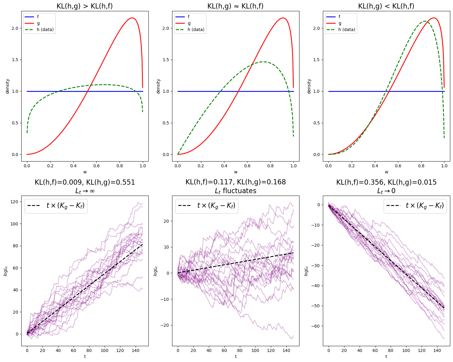
Note that
In the first figure, \(\log L(w^t)\) diverges to \(\infty\) because \(K_g > K_f\).
In the second figure, we still have \(K_g > K_f\), but the difference is smaller, so \(L(w^t)\) diverges to infinity at a slower pace.
In the last figure, \(\log L(w^t)\) diverges to \(-\infty\) because \(K_g < K_f\).
The black dotted line, \(t \left(D_{KL}(h\|g) - D_{KL}(h\|f)\right)\), closely fits the paths verifying (22.1).
These observations align with the theory.
In Heterogeneous Beliefs and Financial Markets, we will see an application of these ideas.
22.7. Hypothesis testing and classification#
This section discusses another application of likelihood ratio processes.
We describe how a statistician can combine frequentist probabilities of type I and type II errors in order to
compute an anticipated frequency of selecting a wrong model based on a sample length \(T\)
compute an anticipated error rate in a classification problem
We consider a situation in which nature generates data by mixing known densities \(f\) and \(g\) with known mixing parameter \(\pi_{-1} \in (0,1)\) so that the random variable \(w\) is drawn from the density
We assume that the statistician knows the densities \(f\) and \(g\) and also the mixing parameter \(\pi_{-1}\).
Below, we’ll set \(\pi_{-1} = .5\), although much of the analysis would follow through with other settings of \(\pi_{-1} \in (0,1)\).
We assume that \(f\) and \(g\) both put positive probabilities on the same intervals of possible realizations of the random variable \(W\).
In the simulations below, we specify that \(f\) is a \(\text{Beta}(1, 1)\) distribution and that \(g\) is \(\text{Beta}(3, 1.2)\) distribution.
We consider two alternative timing protocols.
Timing protocol 1 is for the model selection problem
Timing protocol 2 is for the individual classification problem
Timing Protocol 1: Nature flips a coin only once at time \(t=-1\) and with probability \(\pi_{-1}\) generates a sequence \(\{w_t\}_{t=1}^T\) of IID draws from \(f\) and with probability \(1-\pi_{-1}\) generates a sequence \(\{w_t\}_{t=1}^T\) of IID draws from \(g\).
Timing Protocol 2. Nature flips a coin often. At each time \(t \geq 0\), nature flips a coin and with probability \(\pi_{-1}\) draws \(w_t\) from \(f\) and with probability \(1-\pi_{-1}\) draws \(w_t\) from \(g\).
Here is Python code that we’ll use to implement timing protocol 1 and 2
def protocol_1(π_minus_1, T, N=1000, F_params=(1, 1), G_params=(3, 1.2)):
    """
    Simulate Protocol 1: Nature decides once at t=-1 which model to use.
    """
    F_a, F_b = F_params
    G_a, G_b = G_params

    # Single coin flip for the true model
    true_models_F = np.random.rand(N) < π_minus_1
    sequences = np.empty((N, T))

    n_f = np.sum(true_models_F)
    n_g = N - n_f

    if n_f > 0:
        sequences[true_models_F, :] = np.random.beta(F_a, F_b, (n_f, T))
    if n_g > 0:
        sequences[~true_models_F, :] = np.random.beta(G_a, G_b, (n_g, T))

    return sequences, true_models_F

def protocol_2(π_minus_1, T, N=1000, F_params=(1, 1), G_params=(3, 1.2)):
    """
    Simulate Protocol 2: Nature decides at each time step which model to use.
    """
    F_a, F_b = F_params
    G_a, G_b = G_params

    # Coin flips for each time step
    true_models_F = np.random.rand(N, T) < π_minus_1
    sequences = np.empty((N, T))

    n_f = np.sum(true_models_F)
    n_g = N * T - n_f

    if n_f > 0:
        sequences[true_models_F] = np.random.beta(F_a, F_b, n_f)
    if n_g > 0:
        sequences[~true_models_F] = np.random.beta(G_a, G_b, n_g)

    return sequences, true_models_F
Remark: Under timing protocol 2, the \(\{w_t\}_{t=1}^T\) is a sequence of IID draws from \(h(w)\). Under timing protocol 1, the \(\{w_t\}_{t=1}^T\) is not IID. It is conditionally IID – meaning that with probability \(\pi_{-1}\) it is a sequence of IID draws from \(f(w)\) and with probability \(1-\pi_{-1}\) it is a sequence of IID draws from \(g(w)\). For more about this, see this lecture about exchangeability.
We again deploy a likelihood ratio process with time \(t\) component being the likelihood ratio
The likelihood ratio process for sequence \(\left\{ w_{t}\right\} _{t=1}^{\infty}\) is
For shorthand we’ll write \(L_t = L(w^t)\).
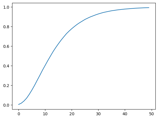
22.7.1. Model selection mistake probability#
We first study a problem that assumes timing protocol 1.
Consider a decision maker who wants to know whether model \(f\) or model \(g\) governs a data set of length \(T\) observations.
The decision makers has observed a sequence \(\{w_t\}_{t=1}^T\).
On the basis of that observed sequence, a likelihood ratio test selects model \(f\) when \(L_T \geq 1 \) and model \(g\) when \(L_T < 1\).
When model \(f\) generates the data, the probability that the likelihood ratio test selects the wrong model is
When model \(g\) generates the data, the probability that the likelihood ratio test selects the wrong model is
We can construct a probability that the likelihood ratio selects the wrong model by assigning a Bayesian prior probability of \(\pi_{-1} = .5\) that nature selects model \(f\) then averaging \(p_f\) and \(p_g\) to form the Bayesian posterior probability of a detection error equal to
Now let’s simulate timing protocol 1 and compute the error probabilities
def compute_protocol_1_errors(π_minus_1, T_max, N_simulations, f_func, g_func,
                              F_params=(1, 1), G_params=(3, 1.2)):
    """
    Compute error probabilities for Protocol 1.
    """
    sequences, true_models = protocol_1(
        π_minus_1, T_max, N_simulations, F_params, G_params)
    l_ratios, L_cumulative = compute_likelihood_ratios(sequences,
                                    f_func, g_func)

    T_range = np.arange(1, T_max + 1)

    mask_f = true_models
    mask_g = ~true_models

    L_f = L_cumulative[mask_f, :]
    L_g = L_cumulative[mask_g, :]

    α_T = np.mean(L_f < 1, axis=0)
    β_T = np.mean(L_g >= 1, axis=0)
    error_prob = 0.5 * (α_T + β_T)

    return {
        'T_range': T_range,
        'alpha': α_T,
        'beta': β_T,
        'error_prob': error_prob,
        'L_cumulative': L_cumulative,
        'true_models': true_models
    }
The following code visualizes the error probabilities for timing protocol 1
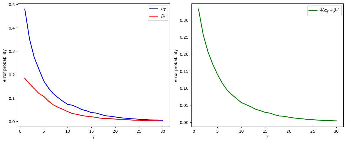
At T=30:
α_30 = 0.0050
β_30 = 0.0020
Model selection error probability = 0.0035
Notice how the model selection error probability approaches zero as \(T\) grows.
22.7.2. Classification#
We now consider a problem that assumes timing protocol 2.
A decision maker wants to classify components of an observed sequence \(\{w_t\}_{t=1}^T\) as having been drawn from either \(f\) or \(g\).
The decision maker uses the following classification rule:
Under this rule, the expected misclassification rate is
where \(\tilde \alpha_t = {\rm Prob}(l_t < 1 \mid f)\) and \(\tilde \beta_t = {\rm Prob}(l_t \geq 1 \mid g)\).
Now let’s write some code to simulate it
def compute_protocol_2_errors(π_minus_1, T_max, N_simulations, f_func, g_func,
                              F_params=(1, 1), G_params=(3, 1.2)):
    """
    Compute error probabilities for Protocol 2.
    """
    sequences, true_models = protocol_2(π_minus_1,
                        T_max, N_simulations, F_params, G_params)
    l_ratios, _ = compute_likelihood_ratios(sequences, f_func, g_func)

    T_range = np.arange(1, T_max + 1)

    accuracy = np.empty(T_max)
    for t in range(T_max):
        predictions = (l_ratios[:, t] >= 1)
        actual = true_models[:, t]
        accuracy[t] = np.mean(predictions == actual)

    return {
        'T_range': T_range,
        'accuracy': accuracy,
        'l_ratios': l_ratios,
        'true_models': true_models
    }
Since for each \(t\), the decision boundary is the same, the decision boundary can be computed as
root = brentq(lambda w: f(w) / g(w) - 1, 0.001, 0.999)
we can plot the distributions of \(f\) and \(g\) and the decision boundary
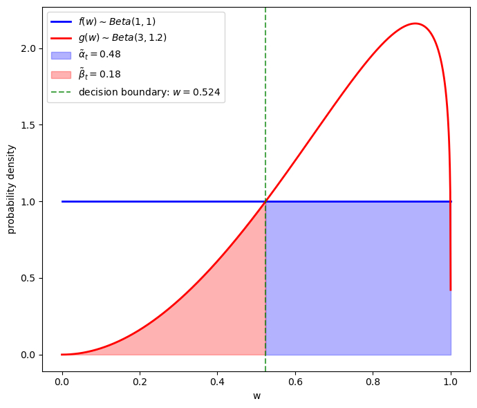
To the left of the green vertical line \(g < f\), so \(l_t > 1\); therefore a \(w_t\) that falls to the left of the green line is classified as a type \(f\) individual.
The shaded red area equals \(\beta\) – the probability of classifying someone as a type \(g\) individual when it is really a type \(f\) individual.
To the right of the green vertical line \(g > f\), so \(l_t < 1\); therefore a \(w_t\) that falls to the right of the green line is classified as a type \(g\) individual.
The shaded blue area equals \(\alpha\) – the probability of classifying someone as a type \(f\) when it is really a type \(g\) individual.
This gives us clues about how to compute the theoretical classification error probability
# Compute theoretical tilde α_t and tilde β_t
def α_integrand(w):
    """Integrand for tilde α_t = P(l_t < 1 | f)"""
    return f(w) if f(w) / g(w) < 1 else 0

def β_integrand(w):
    """Integrand for tilde β_t = P(l_t >= 1 | g)"""
    return g(w) if f(w) / g(w) >= 1 else 0

# Compute the integrals
α_theory, _ = quad(α_integrand, 0, 1, limit=100)
β_theory, _ = quad(β_integrand, 0, 1, limit=100)

theory_error = 0.5 * (α_theory + β_theory)

print(f"theoretical tilde α_t = {α_theory:.4f}")
print(f"theoretical tilde β_t = {β_theory:.4f}")
print(f"theoretical classification error probability = {theory_error:.4f}")
theoretical tilde α_t = 0.4752
theoretical tilde β_t = 0.1836
theoretical classification error probability = 0.3294
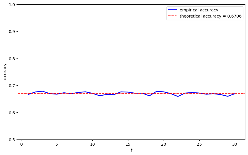
Now we simulate timing protocol 2 and compute the classification error probability.
In the next cell, we also compare the theoretical classification accuracy to the empirical classification accuracy
def analyze_protocol_2(π_minus_1, T_max, N_simulations, f_func, g_func,
                      theory_error=None, F_params=(1, 1), G_params=(3, 1.2)):
    """Analyze Protocol 2."""
    result = compute_protocol_2_errors(π_minus_1, T_max, N_simulations,
                                      f_func, g_func, F_params, G_params)

    # Plot results
    plt.figure(figsize=(10, 6))
    plt.plot(result['T_range'], result['accuracy'],
            'b-', linewidth=2, label='empirical accuracy')

    if theory_error is not None:
        plt.axhline(1 - theory_error, color='r', linestyle='--',
                   label=f'theoretical accuracy = {1 - theory_error:.4f}')

    plt.xlabel('$t$')
    plt.ylabel('accuracy')
    plt.legend()
    plt.ylim(0.5, 1.0)
    plt.show()

    return result

# Analyze Protocol 2
result_p2 = analyze_protocol_2(π_minus_1, T_max, N_simulations, f, g,
                              theory_error, (F_a, F_b), (G_a, G_b))
Let’s watch decisions made by the two timing protocols as more and more observations accrue.
def compare_protocols(result1, result2):
    """Compare results from both protocols."""
    plt.figure(figsize=(10, 6))

    plt.plot(result1['T_range'], result1['error_prob'], linewidth=2,
            label='Protocol 1 (Model Selection)')
    plt.plot(result2['T_range'], 1 - result2['accuracy'],
            linestyle='--', linewidth=2,
            label='Protocol 2 (classification)')

    plt.xlabel('$T$')
    plt.ylabel('error probability')
    plt.legend()
    plt.show()

compare_protocols(result_p1, result_p2)
From the figure above, we can see:
For both timing protocols, the error probability starts at the same level, subject to a little randomness.
For timing protocol 1, the error probability decreases as the sample size increases because we are making just one decision – i.e., selecting whether \(f\) or \(g\) governs all individuals. More data provides better evidence.
For timing protocol 2, the error probability remains constant because we are making many decisions – one classification decision for each observation.
Remark: Think about how laws of large numbers are applied to compute error probabilities for the model selection problem and the classification problem.
22.7.3. Error probability and divergence measures#
A plausible guess is that the ability of a likelihood ratio to distinguish distributions \(f\) and \(g\) depends on how “different” they are.
We have learnt some measures of “difference” between distributions in Statistical Divergence Measures.
Let’s now study two more measures of “difference” between distributions that are useful in the context of model selection and classification.
Recall that Chernoff entropy between probability densities \(f\) and \(g\) is defined as:
An upper bound on model selection error probability is
Let’s compute Chernoff entropy numerically with some Python code
def chernoff_integrand(ϕ, f, g):
    """
    Compute the integrand for Chernoff entropy
    """
    def integrand(w):
        return f(w)**ϕ * g(w)**(1-ϕ)

    result, _ = quad(integrand, 1e-5, 1-1e-5)
    return result

def compute_chernoff_entropy(f, g):
    """
    Compute Chernoff entropy C(f,g)
    """
    def objective(ϕ):
        return chernoff_integrand(ϕ, f, g)

    # Find the minimum over ϕ in (0,1)
    result = minimize_scalar(objective,
                             bounds=(1e-5, 1-1e-5),
                             method='bounded')
    min_value = result.fun
    ϕ_optimal = result.x

    chernoff_entropy = -np.log(min_value)
    return chernoff_entropy, ϕ_optimal
C_fg, ϕ_optimal = compute_chernoff_entropy(f, g)
print(f"Chernoff entropy C(f,g) = {C_fg:.4f}")
print(f"Optimal ϕ = {ϕ_optimal:.4f}")
Chernoff entropy C(f,g) = 0.1212
Optimal ϕ = 0.5969
Now let’s examine how \(e^{-C(f,g)T}\) behaves as a function of \(T\) and compare it to the model selection error probability
T_range = np.arange(1, T_max+1)
chernoff_bound = np.exp(-C_fg * T_range)

# Plot comparison
fig, ax = plt.subplots(figsize=(10, 6))

ax.semilogy(T_range, chernoff_bound, 'r-', linewidth=2,
           label=f'$e^{{-C(f,g)T}}$')
ax.semilogy(T_range, result_p1['error_prob'], 'b-', linewidth=2,
           label='Model selection error probability')

ax.set_xlabel('T')
ax.set_ylabel('error probability (log scale)')
ax.legend()
plt.tight_layout()
plt.show()
Evidently, \(e^{-C(f,g)T}\) is an upper bound on the error rate.
In Statistical Divergence Measures, we also studied Jensen-Shannon divergence as a symmetric measure of distance between distributions.
We can use Jensen-Shannon divergence to measure the distance between distributions \(f\) and \(g\) and compute how it covaries with the model selection error probability.
We also compute Jensen-Shannon divergence numerically with some Python code
def compute_JS(f, g):
    """
    Compute Jensen-Shannon divergence
    """
    def m(w):
        return 0.5 * (f(w) + g(w))

    js_div = 0.5 * compute_KL(f, m) + 0.5 * compute_KL(g, m)
    return js_div
Now let’s return to our guess that the error probability at large sample sizes is related to the Chernoff entropy between two distributions.
We verify this by computing the correlation between the log of the error probability at \(T=50\) under Timing Protocol 1 and the divergence measures.
In the simulation below, nature draws \(N / 2\) sequences from \(g\) and \(N/2\) sequences from \(f\).
Note
Nature does this rather than flipping a fair coin to decide whether to draw from \(g\) or \(f\) once and for all before each simulation of length \(T\).
We use the following pairs of Beta distributions for \(f\) and \(g\) as test cases
distribution_pairs = [
    # (f_params, g_params)
    ((1, 1), (0.1, 0.2)),
    ((1, 1), (0.3, 0.3)),
    ((1, 1), (0.3, 0.4)),
    ((1, 1), (0.5, 0.5)),
    ((1, 1), (0.7, 0.6)),
    ((1, 1), (0.9, 0.8)),
    ((1, 1), (1.1, 1.05)),
    ((1, 1), (1.2, 1.1)),
    ((1, 1), (1.5, 1.2)),
    ((1, 1), (2, 1.5)),
    ((1, 1), (2.5, 1.8)),
    ((1, 1), (3, 1.2)),
    ((1, 1), (4, 1)),
    ((1, 1), (5, 1))
]
Now let’s run the simmulation
# Parameters for simulation
T_large = 50
N_sims = 5000
N_half = N_sims // 2

# Initialize arrays
n_pairs = len(distribution_pairs)
kl_fg_vals = np.zeros(n_pairs)
kl_gf_vals = np.zeros(n_pairs)
js_vals = np.zeros(n_pairs)
chernoff_vals = np.zeros(n_pairs)
error_probs = np.zeros(n_pairs)
pair_names = []

for i, ((f_a, f_b), (g_a, g_b)) in enumerate(distribution_pairs):
    # Create density functions
    f = jit(lambda x, a=f_a, b=f_b: p(x, a, b))
    g = jit(lambda x, a=g_a, b=g_b: p(x, a, b))

    # Compute divergence measures
    kl_fg_vals[i] = compute_KL(f, g)
    kl_gf_vals[i] = compute_KL(g, f)
    js_vals[i] = compute_JS(f, g)
    chernoff_vals[i], _ = compute_chernoff_entropy(f, g)

    # Generate samples
    sequences_f = np.random.beta(f_a, f_b, (N_half, T_large))
    sequences_g = np.random.beta(g_a, g_b, (N_half, T_large))

    # Compute likelihood ratios and cumulative products
    _, L_cumulative_f = compute_likelihood_ratios(sequences_f, f, g)
    _, L_cumulative_g = compute_likelihood_ratios(sequences_g, f, g)

    # Get final values
    L_cumulative_f = L_cumulative_f[:, -1]
    L_cumulative_g = L_cumulative_g[:, -1]

    # Calculate error probabilities
    error_probs[i] = 0.5 * (np.mean(L_cumulative_f < 1) +
                            np.mean(L_cumulative_g >= 1))
    pair_names.append(f"Beta({f_a},{f_b}) and Beta({g_a},{g_b})")

cor_data =  {
    'kl_fg': kl_fg_vals,
    'kl_gf': kl_gf_vals,
    'js': js_vals,
    'chernoff': chernoff_vals,
    'error_prob': error_probs,
    'names': pair_names,
    'T': T_large}
Now let’s visualize the correlations
Evidently, Chernoff entropy and Jensen-Shannon entropy each covary tightly with the model selection error probability.
We’ll encounter related ideas in A Problem that Stumped Milton Friedman very soon.
22.8. Markov chains#
Let’s now look at a likelihood ratio process for a sequence of random variables that is not independently and identically distributed.
Here we assume that the sequence is generated by a Markov chain on a finite state space.
We consider two \(n\)-state irreducible and aperiodic Markov chain models on the same state space \(\{1, 2, \ldots, n\}\) with positive transition matrices \(P^{(f)}\), \(P^{(g)}\) and initial distributions \(\pi_0^{(f)}\), \(\pi_0^{(g)}\).
We assume that nature samples from chain \(f\).
For a sample path \((x_0, x_1, \ldots, x_T)\), let \(N_{ij}\) count transitions from state \(i\) to \(j\).
The likelihood process under model \(m \in \{f, g\}\) is
Hence,
The log-likelihood ratio is
22.8.1. KL divergence rate#
By the ergodic theorem for irreducible, aperiodic Markov chains, we have
where \(\boldsymbol{\pi}^{(f)}\) is the stationary distribution satisfying \(\boldsymbol{\pi}^{(f)} = \boldsymbol{\pi}^{(f)} P^{(f)}\).
Therefore,
Taking the limit as \(T \to \infty\), we have:
The first term: \(\frac{1}{T}\log \frac{\pi_{0,x_0}^{(f)}}{\pi_{0,x_0}^{(g)}} \to 0\)
The second term: \(\frac{1}{T}\sum_{i,j}N_{ij}\log \frac{P_{ij}^{(f)}}{P_{ij}^{(g)}} \xrightarrow{a.s.} \sum_{i,j}\pi_i^{(f)}P_{ij}^{(f)}\log \frac{P_{ij}^{(f)}}{P_{ij}^{(g)}}\)
Define the KL divergence rate as
where \(KL(P_{i\cdot}^{(f)}, P_{i\cdot}^{(g)})\) is the row-wise KL divergence.
By the ergodic theorem, we have
Taking expectations and using the dominated convergence theorem, we obtain
Here we invite readers to pause and compare this result with (22.1).
Let’s confirm this in the simulation below.
22.8.2. Simulations#
Let’s implement simulations to illustrate these concepts with a three-state Markov chain.
We start by writing functions to compute the stationary distribution and the KL divergence rate for Markov chain models.
Now let’s create an example with two different 3-state Markov chains.
We are now ready to simulate paths and visualize how likelihood ratios evolve.
We verify \(\frac{1}{T}E_f\left[\log \frac{L_T^{(f)}}{L_T^{(g)}}\right] = h_{KL}(f, g)\) starting from the stationary distribution by plotting both the empirical average and the line predicted by the theory
# Define example Markov chain transition matrices
P_f = np.array([[0.7, 0.2, 0.1],
                [0.3, 0.5, 0.2],
                [0.1, 0.3, 0.6]])

P_g = np.array([[0.5, 0.3, 0.2],
                [0.2, 0.6, 0.2],
                [0.2, 0.2, 0.6]])

markov_results = analyze_markov_chains(P_f, P_g)
Stationary distribution (f): [0.41176471 0.32352941 0.26470588]
Stationary distribution (g): [0.28571429 0.38095238 0.33333333]

KL divergence rate h(f, g): 0.0588
KL divergence rate h(g, f): 0.0563
22.10. Exercises#
Exercise 22.1
Consider the setting where nature generates data from a third density \(h\).
Let \(\{w_t\}_{t=1}^T\) be IID draws from \(h\), and let \(L_t = L(w^t)\) be the likelihood ratio process defined as in the lecture.
Show that:
with finite \(K_g, K_f\), \(E_h |\log f(W)| < \infty\) and \(E_h |\log g(W)| < \infty\).
Hint: Start by expressing \(\log L_t\) as a sum of \(\log \ell(w_i)\) terms and compare with the definition of \(K_f\) and \(K_g\).
Solution
Since \(w_1, \ldots, w_t\) are IID draws from \(h\), we can write
Taking the expectation under \(h\)
Since the \(w_i\) are identically distributed
where \(w \sim h\).
Therefore
Now, from the definition of Kullback-Leibler divergence
This gives us
Similarly
Substituting back
Exercise 22.2
Building on Exercise 22.1, use the result to explain what happens to \(L_t\) as \(t \to \infty\) in the following cases:
When \(K_g > K_f\) (i.e., \(f\) is “closer” to \(h\) than \(g\) is)
When \(K_g < K_f\) (i.e., \(g\) is “closer” to \(h\) than \(f\) is)
Relate your answer to the simulation results shown in this section.
Solution
From Exercise 22.1, we know that:
Case 1: When \(K_g > K_f\)
Here, \(f\) is “closer” to \(h\) than \(g\) is. Since \(K_g - K_f > 0\)
By the Law of Large Numbers, \(\frac{1}{t} \log L_t \to K_g - K_f > 0\) almost surely.
Therefore \(L_t \to +\infty\) almost surely.
Case 2: When \(K_g < K_f\)
Here, \(g\) is “closer” to \(h\) than \(f\) is. Since \(K_g - K_f < 0\)
Therefore by similar reasoning \(L_t \to 0\) almost surely.